A Beginners Guide to Portfolio Analytics

Journo Portfolio
Published onIt is important to keep in mind the end goal of your portfolio. If you mainly have your portfolio to send to prospective employers then analytics is less useful to you, although you can still analyse what they did on your site and how long they spent on it, you should then focus on using your analytics to optimise the site for generating the most clicks and time spent on the site. If you are instead trying to showcase your work to as many people as possible it is important to understand where visitors are coming from and focus on building similar links.
The Journo Portfolio Dashboard
Journo Portfolio provides a basic analytics dashboard to get a quick overview of how your site is doing. If you need more powerful analytics you can install Google Analytics very easily in the 'Integrations' tab of the Dashboard.
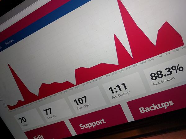
The first and most obvious metric is the brightly coloured plot at the top of the Dashboard. This shows you a plot of the page views your portfolio has had over the last 30 days.
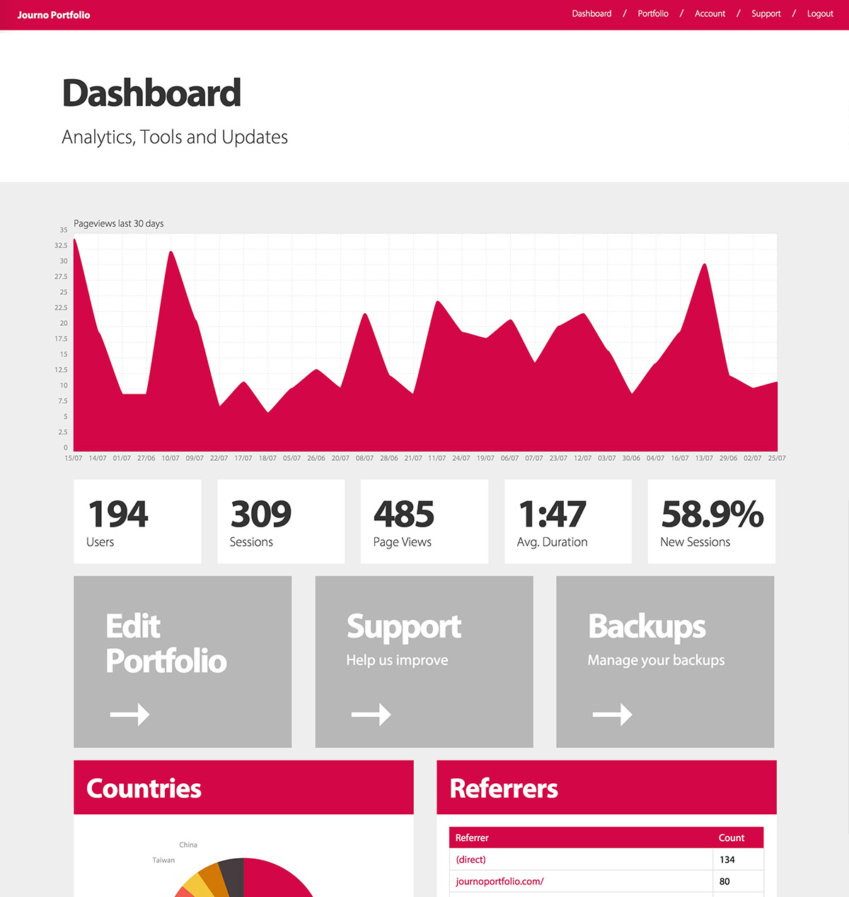
Your Journo Portfolio Dashboard also provides you with 5 key metrics for your portfolio over the last 30 days. These are:
- Visitors: How many individual people have visited your website over the given time period.
- Sessions: Each time someone visits your site they may visit multiple pages, the whole visit is called a session. The number of sessions will always be bigger than the number of visitors.
- Page Views: How many times were any of the pages on your website viewed. If I visit your site right now and go on three different pages that will be one session but three page views.
- Avg. Duration: How long, on average, each visitor spent on your portfolio.
- New Sessions: This is the percent of sessions which are the visitors first visit to your website.
Finally, the dashboard gives you two tables. The on the left shows you your top Referrers, these are URLs that visitors to your site came from. This lets you identify how people are finding you and lets you see which methods of sharing your portfolio are working most effectively.
The table on the right gives you a descending tally of article clicks, allowing you to see which articles grabbed peoples attention and caused them to click through. Of course, articles at the top of the page will be more likely to be clicked.
Google Analytics
If you need more powerful analytics and access to the raw data you can easily add a Google Analytics (GA) account tracking number on the 'Integrations' page. You will then be able to view the data on the GA platform, which lets you do some of the following: - See on a map where visitors are from. - View a live version of your site with a heatmap of where visitors click. - Drill down into the other analytics to get a better understanding of what is happening.
SumoMe
You can also integrate with SumoMe in a similar way to Google Analytics which will allow you to view a heat map, build a list of email subscribers or add a scroll box.